On reels of magnetic tapein a climate-controlled government basement in College Park, Maryland sit a detailed record of the last sixty years of the airline industry. These circular reels document, like rings of a tree, the financial pressures, world events, and technical innovations driving the American air travel industry in the Jet Age.
Every quarter for the better part of the last century, airlines have filed detailed information about operational expenses, route traffic data, and aircraft inventories on Form 41.
COVID-19 brought the airline industry back to Kitty Hawk
Monthly passenger volume has grown steadily since 1974, but the pandemic saw a 96% decrease from pre-pandemic levels
Each ring represents a year of domestic passenger air travel, as measured by monthly passenger volume • The “96% decrease” figure compares April 2020 and April 2019 • Source: Bureau of Transportation Statistics
The airline industry has enjoyed steady growth, with few exceptions. Even throughout oil crises, recessions, and the 9/11 terrorist attacks, passenger volume was quick to recover. Except the COVID-19 pandemic, when passenger volume fell almost overnight to just 4% of pre-pandemic levels. Even the biggest cross-country routes were hollowed out, running near-empty planes and slashing capacity. The pandemic is visible on almost every airline-related graph.
Airlines are a “death trap” for investors, if not passengers
United has only broken above its 2006 share price on 50% of days since then, compared to 85% for the S&P 500
United Airlines often lags the stock market, returning 2.6x since 2006 compared to the S&P 500’s 5.5x • Source: Google Finance
Warren Buffet has long been a vocal airline hater, going far as to call them a “death trap” for retail investors. “If a farsighted capitalist had been present at Kitty Hawk,” Buffet wrote in a 2008 letter to shareholders, “he would have done his successors a huge favor by shooting Orville down.”
Airlines as a business have uniquely high capital and labor costs. They are slow to adapt to world events, but quick to adopt even the smallest cost efficiencies.
Marginal improvements to fuel efficiency and new aircraft form factors can turn unprofitable routes profitable and take a quarter from red to black. Airliners have seen a steady stream of improvements to safety, efficiency, reliability, noise, and comfort.
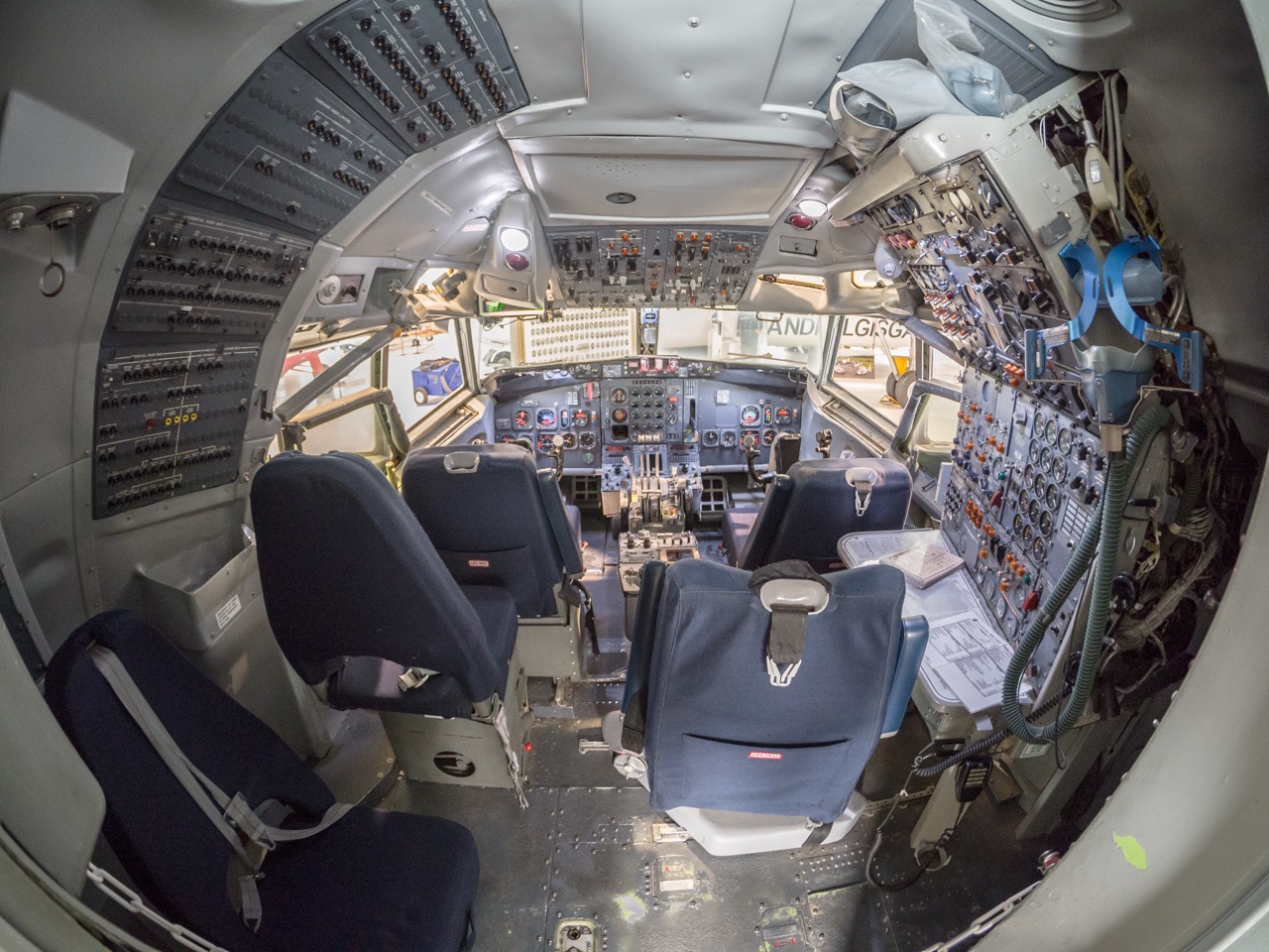
Boeing killed the flight engineer
In a world of computerized aircraft, spending on flight engineers per flight hour has fallen to near-zero
Pilot- and flight engineer-related operating expenses per flight hour (major passenger airlines, inflation-adjusted) • Source: Bureau of Transportation Statistics
The highly-computerized Boeing 757 and 767 models both entered passenger service in the 1980s. Pilots were able to monitor fuel and other aircraft vitals themselves, eliminating the need for a third crewmember in the cockpit. While it took several decades for airlines to retire or retrofit three-crew aircraft, operational expenses dedicated to flight engineers only fell, even in the face of record passenger volume.
But eliminating the flight engineer was far from the first time technical advancements helped airlines cut operating costs.
The cockpit of the Boeing 727 with a third station behind the first officer’s seat on the right • Credit: James Petts (Wikimedia Commons)
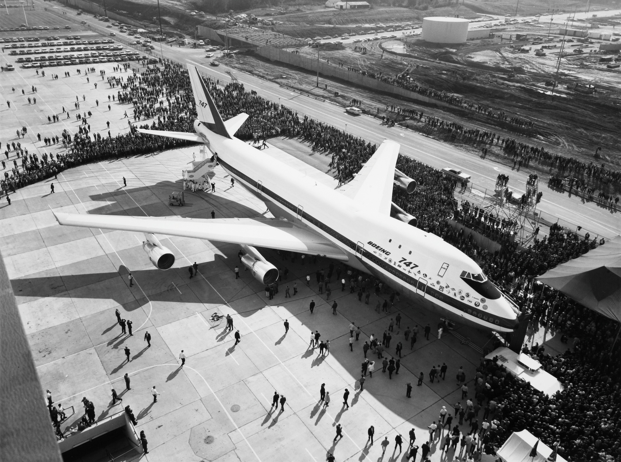
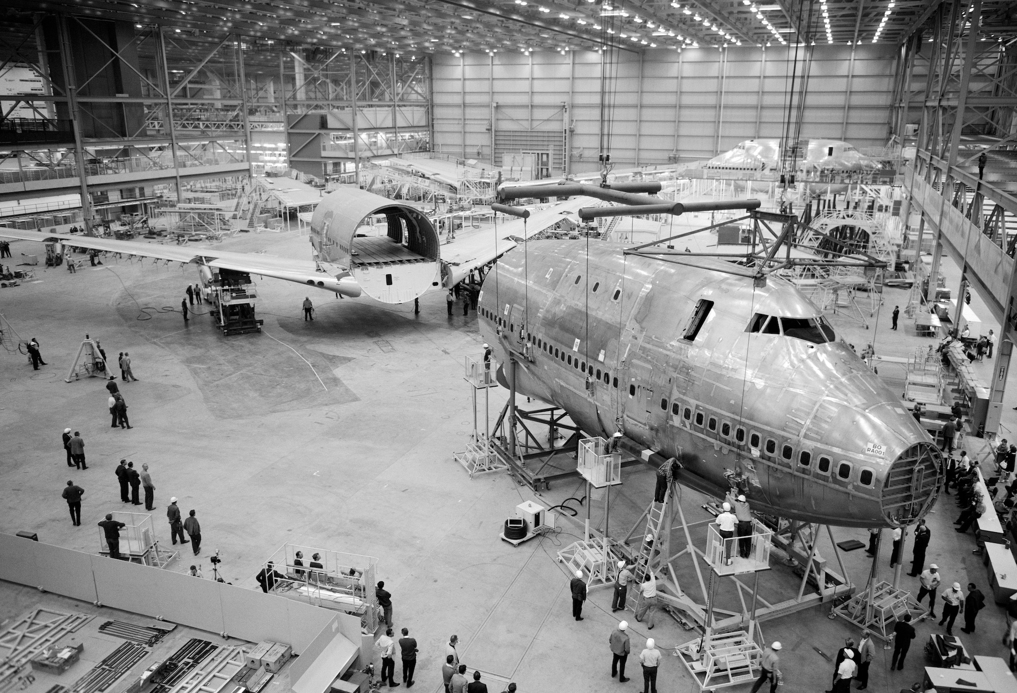
In 1968, the world’s largest jet rolled out of the world’s largest building, purpose-built the year before for this moment. The public milled about its massive landing gear as uniformed flight attendants from each airline lined up for a photo op.
It was the Boeing 747, the world’s first Jumbo Jet; the Queen of the Skies.
The prototype Boeing 747 “City of Everett” was unveiled to the public on September 30, 1968 • Credit: Scandinavian Airlines System, Boeing, National Air and Space Museum
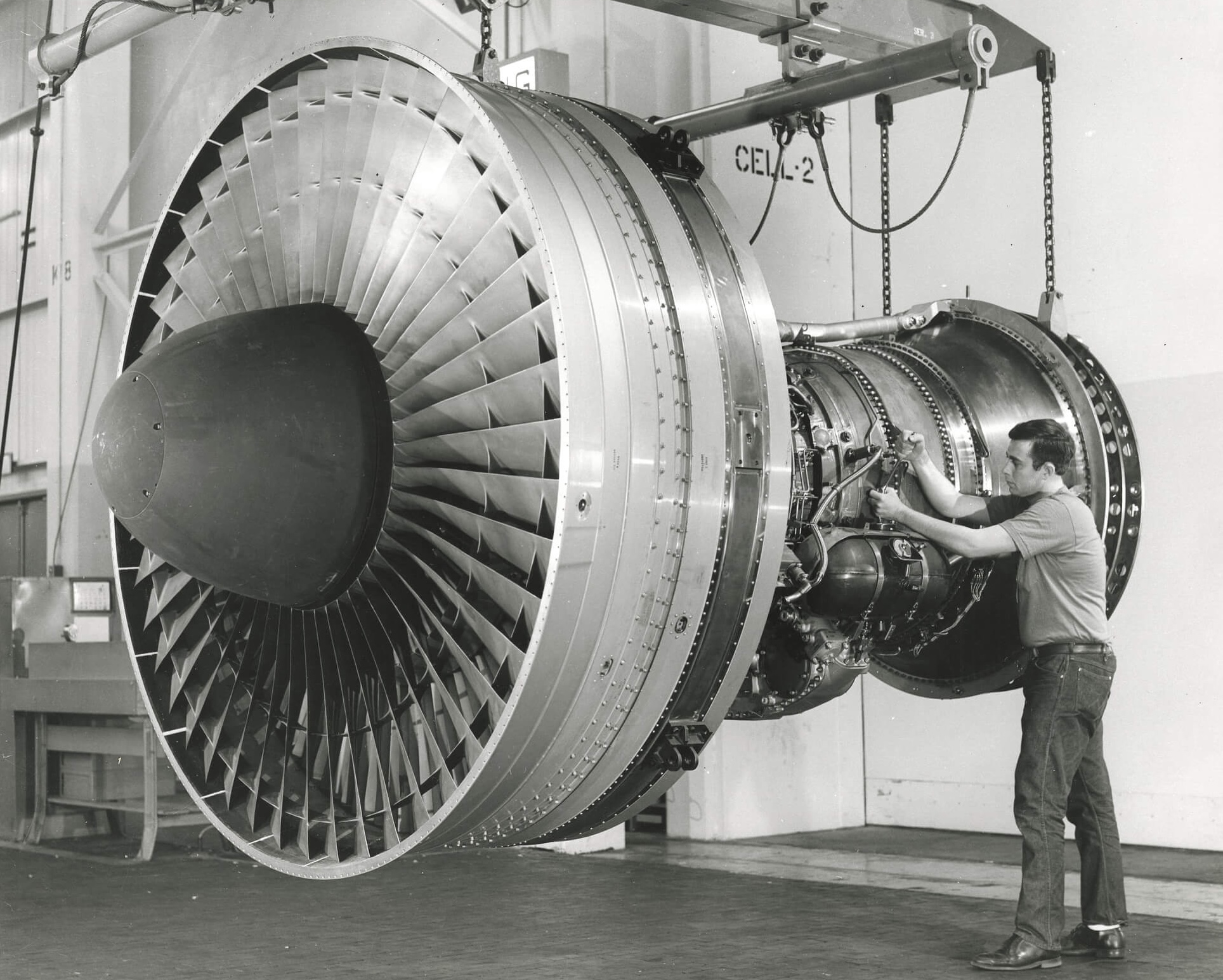
Bolted to her wings were four of the world’s most advanced engines, the first of their kind on an airliner, high-bypass Pratt & Whitney JT9D turbofans. High-bypass engines offered a step change in efficiency, reliability, and noise reduction. As they became standard in the industry, fuel and maintenance costs only fell.
Materials advancements have improved airframes, but there’s more to be gained in weight and fuel efficiency than maintenance costs. (Half the structural weight of the Boeing 787 Dreamliner, introduced in 2011, comes from composite materials. Boeing claims this helps it achieve a 25% reduction in fuel costs over the aircraft it replaces.)
Engine and airframe maintenance labor operating expenses per flight hour (major passenger airlines, inflation-adjusted) • Source: Bureau of Transportation Statistics
The 747 was the first wide-body airliner and could carry more than twice as many passengers as the next largest—the Douglas DC-8 and the Boeing 707—while using less fuel per passenger. This allowed Pan Am to reduce its seat cost by 30%. However, this didn’t immediately translate to lower airfares.
Before the Airline Deregulation Act of 1978, airfares and routes were controlled by the Civil Aeronautics Board. The justification for this authority was that industries with high fixed costs, like airlines, tended towards monopoly. The concern was that letting airlines compete on cost, like railroads the century before, would lead to price wars that would deteriorate safety, followed by monopoly consolidation.
After deregulation, airlines had more control over the price of tickets. They traded margin for demand, and air travel exploded. The number of passengers has tripled since 1978, while the inflation-adjusted price of airfare has halved (and maybe legroom).
This new cost pressure made airlines acutely aware of every operational expense. Airliners cost hundreds of millions of dollars—and billions over their decades-long lifetime to operate and maintain. They demanded that each new generation of aircraft provide significant advancements over the previous generation.
Airlines’ new freedom to set prices and routes also enabled the rise of low-cost carriers. Their business models rely on “point-to-point” route scheduling and uniform fleets to reduce maintenance costs, a departure from traditional “hub-and-spoke” airlines.
If you’re lucky enough to live near one of United’s seven mainland US hubs (in red), you have access to frequent, direct flights to most major American cities, and many in Europe and Asia. If you are traveling to or from a smaller airport, you might have to take a smaller regional jet to connect to a United hub—as many as three planes in the worst-case.
United is an example of a hub-and-spoke airline. It operates large narrow- and wide-body aircraft between major nationwide hubs, and smaller aircraft between hubs and regional airports.
Southwest, however, employs a point-to-point model that allows it to compete on price and offer more direct flights.
Because Southwest’s fleet consists exclusively of narrow-body Boeing 737 aircraft—which seat as many as 175 passengers—it can only serve routes with enough demand to fill a larger aircraft, making its “point-to-point” function more like “hub-to-hub.” This is why—on this map, where thicker lines indicate higher passenger volume—Southwest’s route lines are all roughly the same thickness.
This leaves point-to-point airlines to compete not on destinations, but price. The world’s largest point-to-point airlines—Ryanair, Southwest, EasyJet—are all budget carriers.
United’s smaller CRJs, on the other hand, carry as few as 50. United trades fewer direct flights for more destinations—despite transporting the same number of passengers as Southwest in 2024, United did so between nearly three times as many airports, albeit often less affordably.
While Southwest might be able to run direct flights between secondary hubs where United could not, it’s impossible for Southwest to economically serve smaller destinations.
I reconstructed this obscure dataset by reading typewritten data manifests and decoding nine-track magnetic tape binaries, produced by the big iron mainframes of the 60s and 70s.
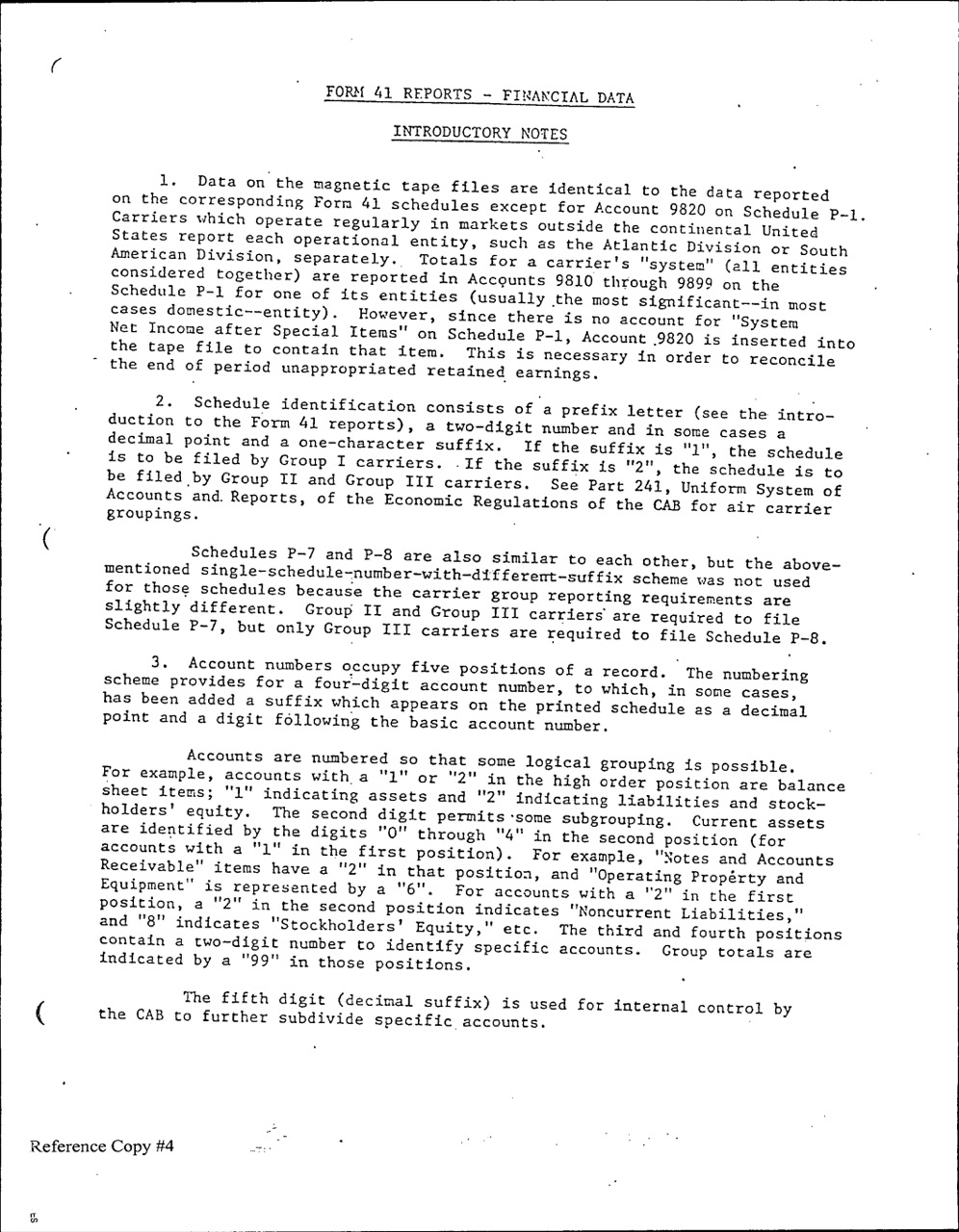
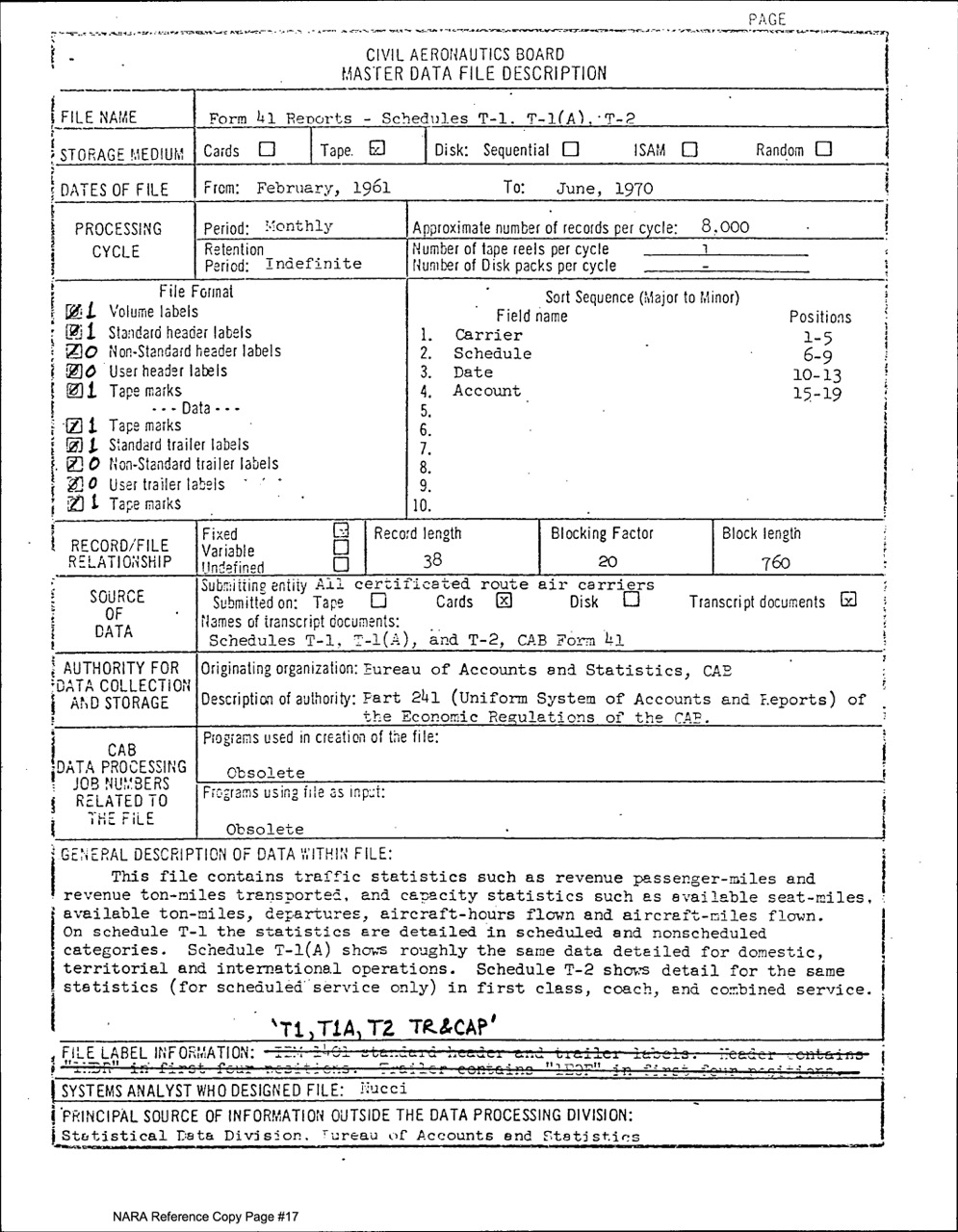
Data for this project came from Form 41, currently under the purview of the Bureau of Transportation Statistics of the Department of Transportation. It was previously produced by the Civil Aeronautics Board. Data from 1990 is available easily online (I used schedules P-5, T-100, and T-1). The National Archives has data in a machine-readable format as far back as 1957 (NAID 19078269), with one catch: the machines that can read it are IBM System/360 mainframes operating on magnetic tape storage.
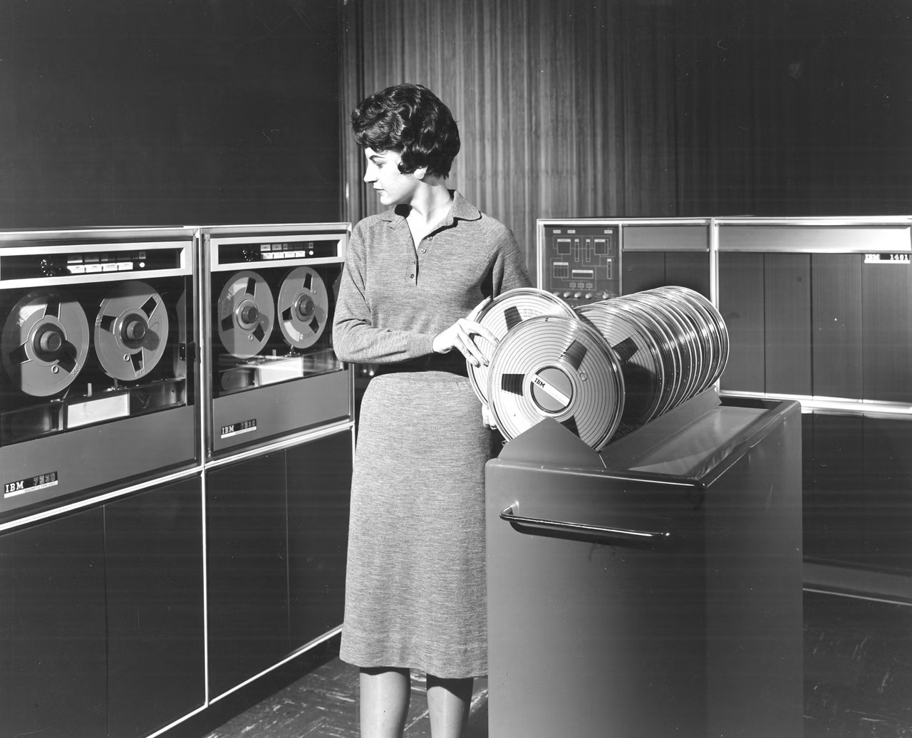
A promotional image shows the IBM 1401’s tape drives • Credit: IBM
It was relatively straightforward to parse these files and convert them from EBCDIC text encoding into UTF-8 (ASCII, realistically). The more difficult task was matching account numbers between the two datasets, which required reading old editions of the Code of Federal Regulations. I was never able to figure out account codes for the oldest Schedule T-1 traffic data, so my traffic charts unfortunately start in 1974 instead of 1960.
Older data would require tracking down copies of the “Handbook of Airline Statistics,” published by the Civil Aeronautics Board from 1943–1975. Copies from 1945–1956 are available online, but would need to be made machine readable. The earliest source of airline statistics I’ve found is the “Air Commerce Bulletin,” produced from 1929–1939, which is only available in-person at the Library of Congress—maybe next time I’m in DC!
These datasets really kicked me when I was down. Schedule T-1 is inexplicably divided by 2 in 1989. The account number “PLUS1” appears in a handful of magnetic tape Schedule P-5 rows and is documented nowhere. Data manifests give advice for processing the data in COBOL. Data on airline ticket prices from 1968–2005 is restricted because it apparently contains trade secrets—I would have to petition the Bureau of Transportation Statistics for access.
I am, however, incredibly grateful to the archivists at the National Archives (like P. Dian Palmer, whose name is on many of the scanned manifests) who prepared this data and put it online. More than 677 magnetic tapes were combined for Schedule T-1 alone. Whenever I go searching for data like this, I am awestruck by the government apparatus responsible for its collection and preservation.
All money values are inflation-adjusted into 2025 dollars using the standard urban consumer price index from the Bureau of Labor Statistics. There exist airline- and aircraft-specific producer price indexes, but none of them go back far enough. Fortunately, they roughly track the standard consumer price index.
Stock market data comes from Google Finance. Bankruptcies and mergers make it hard to go back too far on major airline share prices.
The charts were made with Observable Plot. The monospace font is OCR-B, which was developed by Adrian Frutiger in 1968 and intended to be readable by humans and computers. It is commonly found on boarding passes. The sans-serif font is Alte Haas Grotesk by Yann Le Coroller, designed to look like phototypeset Helvetica. The design of the project was vaguely inspired by George Tscherny’s Pan Am city maps from 1973.